
The Goal
Being design systems the best way to give digital products a fully consistent, organized and integrated library, this project was conceived to generated a portfolio piece with a design system case study.
It all begins with the idea of having a weekly space to learn, apply and execute best practices and methods for design systems.
The project consisted in choosing a brand, in my case Santander Bank, to give a new approach to the different elements that compound the bank interphases and to implement a different perspective on how this new library can help users, designers and developers to understand better the Santander app and the Santander website.

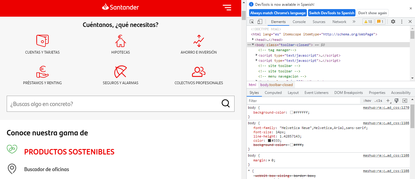
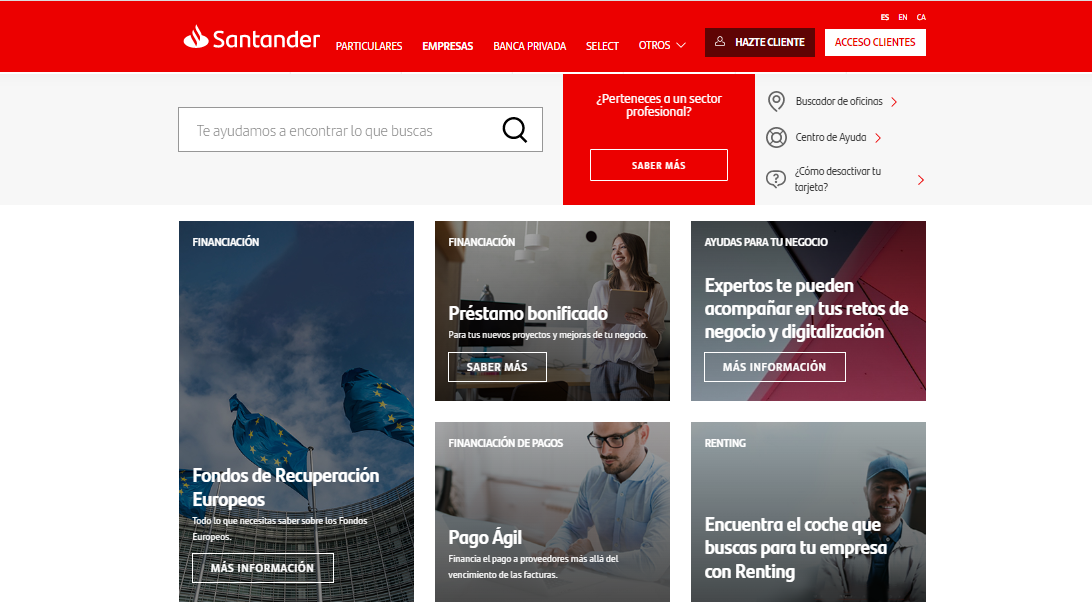
Santander Bank current website layout
-
Doctype
The Santander website is using Helvetica Neue, Helvetica, Arial, Sans-serif. 14px
-
Layout
Heading, nav bar in capitals, color value EC0000 contrast with typography in white
Santander Bank Design System
Revamp Case study
Considering the main importance of a design system in a design process this case study was based on analyze existing Santander Bank Design system and try to improve some of the items and components they already have.
Also, try to highlight the relevance of a design system as an accessible document library, making sure designers and developers understand the use of icons, color pallet, buttons and typography.
The template created to document color values, shows gradients, values from 100 to 400 or 500, color role in the system, contrast / accessibility test and design token for developers.
Colors were tested to make sure they pass accessibility.
-
HEX Value and named values from 100 to 500
-
This feature describes how and where the value is used in the inter phase
-
Body and button contrast to check if the value passes the accessibility test
-
Correspond to the code, order or name given to the value in the system to be applied by the developers team
Color


Typographic
Text / Typo
This part of the library was dedicated to the typographic and text styles, a very important part of the design system core. Basically here are documented the fonts used along the design inter phase, specifying sizes, weights, and uses.


Founts
NotoSans for Headings from 16/24 to 32/36
Roboto for Body text from 10/16 to 18/28

Iconography

Three set icons were created:
Indicators, Actions, and Person/User
Each icon icon has an active, default, and disabled state. Different variants had to be considered, like size, type or color. To be able to create those variants different component sets were created.Our icons are created using feather icons
-
To Indicate the user how to proceed or what direction should take during his/her journey across the interphase
-
Icons in this group were used to indicate the user to take an action for example: call us, contact us.
-
All the icons from this category are related with users profile, for example add a person or remove a person.
Buttons
Three different set buttons were created:
Left Icon button, just text button and Right Icon button

-
This layout has a set of buttons with icon positioned at the left with text.

-
This set of buttons is more simple. consisting only of buttons with text, no icons.

-
For this set of buttons the configuration is text and then icon at the right site..